
Color Story Android: A Deep Dive into Visual Expression on Your Mobile Device
The Color Story app, a popular mobile application celebrated for its robust suite of photo editing tools, has seen a significant expansion of its capabilities with its recent full integration and feature parity on the Android platform. This development marks a crucial moment for Android users, finally granting them access to the same sophisticated color grading, filter application, and creative manipulation tools that iOS users have enjoyed for years. Historically, the Android version lagged behind its iOS counterpart, creating a bifurcated user experience. However, with this comprehensive update, Color Story aims to democratize its powerful visual storytelling capabilities, making it an indispensable tool for content creators, social media enthusiasts, and anyone looking to elevate their mobile photography and videography. This article will explore the core functionalities, unique selling propositions, and the profound impact of Color Story’s full Android release on the mobile editing landscape.
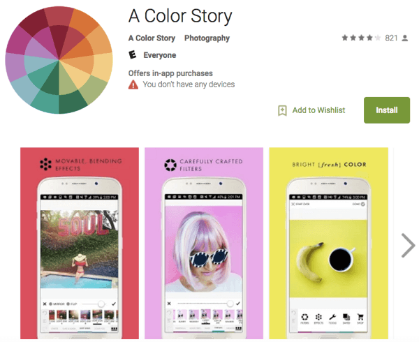
At its heart, Color Story on Android is built upon a foundation of intuitive yet powerful editing tools. The application’s strength lies in its ability to move beyond basic adjustments, offering a nuanced approach to color manipulation. Users will find an extensive library of meticulously crafted filters, categorized by aesthetic and mood, allowing for rapid mood setting and stylistic consistency across their image and video portfolios. These filters are not merely overlays; they are sophisticated presets that can be adjusted in intensity, providing a high degree of control. Beyond pre-set filters, the app boasts a comprehensive set of manual adjustment tools. This includes granular control over exposure, contrast, saturation, highlights, shadows, white balance, and tint. For those seeking to truly master their visuals, Color Story on Android provides split toning capabilities, enabling the application of different color tints to the highlights and shadows of an image, a technique often reserved for professional desktop software. HSL (Hue, Saturation, Luminance) sliders are also present, offering precise control over individual color channels, allowing for the fine-tuning of specific hues, their intensity, and their brightness. This level of control is critical for achieving a signature look or correcting color casts with accuracy.
A significant differentiator for Color Story is its emphasis on creative effects and textures. The Android version now fully supports features like light leaks, dust and scratch overlays, and various textural elements. These additions are designed to add depth, character, and a vintage or artistic flair to images and videos. The ability to blend these effects with the underlying media, controlling their opacity and blending modes, allows for a truly unique and personalized output. This is particularly valuable for users aiming for a specific aesthetic, such as a retro film look or a more ethereal, dreamy quality. The integration of these stylistic elements, coupled with the advanced color grading tools, positions Color Story as a versatile platform for both subtle enhancements and bold artistic statements. The app’s commitment to providing tools that foster creative exploration without overwhelming the user is a key aspect of its success.
Video editing capabilities have also been a major focus of the Android rollout. Color Story now offers robust video editing features, mirroring the functionality available on iOS. This includes the ability to apply filters, adjust color grading, and add effects to video clips directly within the app. Users can trim, reorder, and merge video clips, as well as adjust playback speed for dramatic slow-motion or fast-forward effects. The ability to maintain consistent color grading across a series of video clips is essential for creating cohesive narratives, and Color Story provides the tools to achieve this. The inclusion of video editing in a predominantly photo-focused app highlights the evolving nature of mobile content creation, where a seamless transition between still and moving images is increasingly expected. This integrated approach streamlines the workflow, eliminating the need to switch between multiple applications for different media types.
The introduction of new features and the expansion of existing ones on Android are not just about mirroring iOS; they represent an investment in the Android ecosystem. This includes a constant influx of new filters, effects, and editing tools released periodically, ensuring the app remains fresh and relevant. The development team behind Color Story has a history of actively listening to user feedback, and this has been evident in the comprehensive nature of the Android release. Features like the "Bold" and "Magic" filter packs, which offer distinct stylistic choices, are now readily available. The "Overlays" section, featuring a diverse range of light leaks, textures, and bokeh effects, is crucial for adding a professional touch. Furthermore, the app’s "Effects" tab offers a wealth of creative options, including blur, distortion, and vignette adjustments, enabling users to further refine their compositions. The inclusion of a "Curves" adjustment tool, a powerful feature for advanced color manipulation and tonal control, significantly elevates the editing potential for discerning users.
For social media influencers, content creators, and businesses relying on visual marketing, Color Story on Android offers a significant advantage. The ability to quickly and efficiently create high-quality, visually appealing content that aligns with a brand’s aesthetic is paramount. The app’s emphasis on creating a consistent visual identity across multiple posts or videos is a critical asset. The direct sharing capabilities to major social media platforms further streamline the content creation and distribution pipeline. The consistent availability of these powerful tools on Android means that a wider audience of creators can now leverage Color Story to enhance their online presence and engage their followers more effectively. This democratization of professional-grade editing tools is a testament to the growing maturity of mobile creative platforms.
Beyond the technical features, the user interface (UI) and user experience (UX) of Color Story on Android have been thoughtfully designed. The app prioritizes an intuitive workflow, making complex editing processes accessible to users of all skill levels. The layout is clean, with readily identifiable icons and well-organized menus. Navigation between different editing modules is seamless, allowing for efficient experimentation and refinement. The real-time preview functionality, which displays the impact of edits instantly, is crucial for making informed decisions. The ability to undo and redo actions, along with the option to save edits as presets, further enhances the user-friendly nature of the application. This focus on a positive user experience is vital for retaining users and encouraging ongoing engagement with the app’s extensive features.
The ongoing development of Color Story suggests a continued commitment to innovation. Future updates are likely to introduce even more advanced features, potentially incorporating AI-driven editing tools, enhanced video editing capabilities, and an expanded library of filters and effects. The growing demand for high-quality visual content across all digital platforms ensures that apps like Color Story will remain at the forefront of mobile creativity. The full integration on Android signifies a significant step in this direction, opening up the app’s powerful capabilities to a vast and diverse user base. The potential for Color Story to become the go-to editing solution for millions of Android users worldwide is now a tangible reality. The application’s ability to deliver professional-level results without requiring specialized hardware or extensive training makes it an invaluable asset for anyone looking to express themselves visually in the digital age. The color story is no longer just an iOS phenomenon; it is now a universally accessible platform for mobile visual artistry.
