Dark Theme iOS Apps: A Deep Dive into Aesthetics, Accessibility, and Performance
The adoption of dark themes across iOS applications has transcended a mere aesthetic trend to become a significant design consideration impacting user experience, accessibility, and even battery life. Initially popularized for its visually striking appearance, the dark mode offers a suite of benefits that developers and users alike have come to appreciate. This article will explore the multifaceted advantages of dark themes in iOS apps, delving into their visual impact, psychological benefits, accessibility enhancements, and the performance implications, particularly concerning OLED displays.
From a purely aesthetic standpoint, dark themes provide a sophisticated and modern visual appeal. They leverage deep blacks and muted colors to create a sense of depth and elegance. This is particularly effective in content-heavy applications like e-readers, news aggregates, and coding environments where a reduction in overall screen brightness can lead to a more comfortable viewing experience. The contrast between bright text or UI elements and a dark background can make content pop, improving readability for some users and reducing eye strain during prolonged use, especially in low-light conditions. The visual hierarchy is often enhanced as well, with elements designed to stand out against the darker backdrop. This can simplify navigation and information processing, making the app feel more intuitive. Furthermore, dark themes can contribute to a more immersive user experience. By minimizing distractions from a bright screen, users can focus more intently on the content at hand, leading to a deeper engagement with the application. For creative professionals, a dark interface can also serve as a neutral canvas, preventing the bright interface of design tools from influencing their perception of color in their work. The psychological impact of dark themes is also noteworthy. Many users associate dark interfaces with professionalism, maturity, and a sense of calmness. This can positively influence their perception of an app, making it feel more premium and trustworthy. The reduced light emission can also contribute to a more relaxed atmosphere, which is beneficial for apps used before sleep or during downtime.
Accessibility is a cornerstone of modern app development, and dark themes play a crucial role in making iOS apps usable for a wider audience. For individuals with light sensitivity or photophobia, a dark theme significantly reduces the amount of light emitted by the screen, alleviating discomfort and potential pain. This makes apps accessible to a demographic that might otherwise struggle with brightly lit interfaces. Furthermore, for users with certain visual impairments, such as cataracts, high contrast between text and background becomes paramount. While white text on a black background offers high contrast, careful consideration must be given to the specific shades of gray and luminosity to avoid eye strain. Apps that implement dark themes thoughtfully often provide adjustable contrast ratios or offer variations within the dark mode to cater to diverse visual needs. The World Health Organization (WHO) recognizes visual impairment as a significant global health issue, and accessible design practices, including the provision of dark modes, are essential in ensuring digital inclusion. By offering a dark theme, developers are not just catering to a preference; they are actively removing barriers to access for a substantial segment of the population. The ability to switch between light and dark modes also empowers users to customize their experience based on environmental factors and personal comfort levels. This flexibility is a hallmark of inclusive design.
The performance benefits of dark themes, particularly for devices equipped with OLED or AMOLED displays, are substantial and directly impact battery life. These display technologies work by illuminating individual pixels. In a dark theme, many pixels are turned off or emit very little light, especially when displaying pure black. Conversely, in a light theme, a majority of pixels are actively emitting light, consuming more power. This difference can lead to a noticeable reduction in battery consumption for users who primarily utilize dark mode. Research and real-world testing have shown that prolonged use of dark themes on OLED screens can extend battery life by a significant margin, often ranging from 15% to 40% or even more depending on the specific app and usage patterns. This is a compelling reason for users to adopt dark mode and for developers to implement it. Beyond battery life, the reduced power consumption can also lead to less heat generation within the device, contributing to a more comfortable user experience and potentially prolonging the lifespan of the device’s battery over time. While LCD displays, which rely on a backlight that is always on, do not offer the same battery savings with dark themes, the visual comfort and aesthetic advantages remain. However, the prevalence of OLED displays in modern iPhones, from the iPhone X onwards, makes the battery-saving aspect of dark themes increasingly relevant. Developers who optimize their apps for dark mode are not only enhancing visual appeal but also contributing to the practical usability and efficiency of the devices their apps run on.
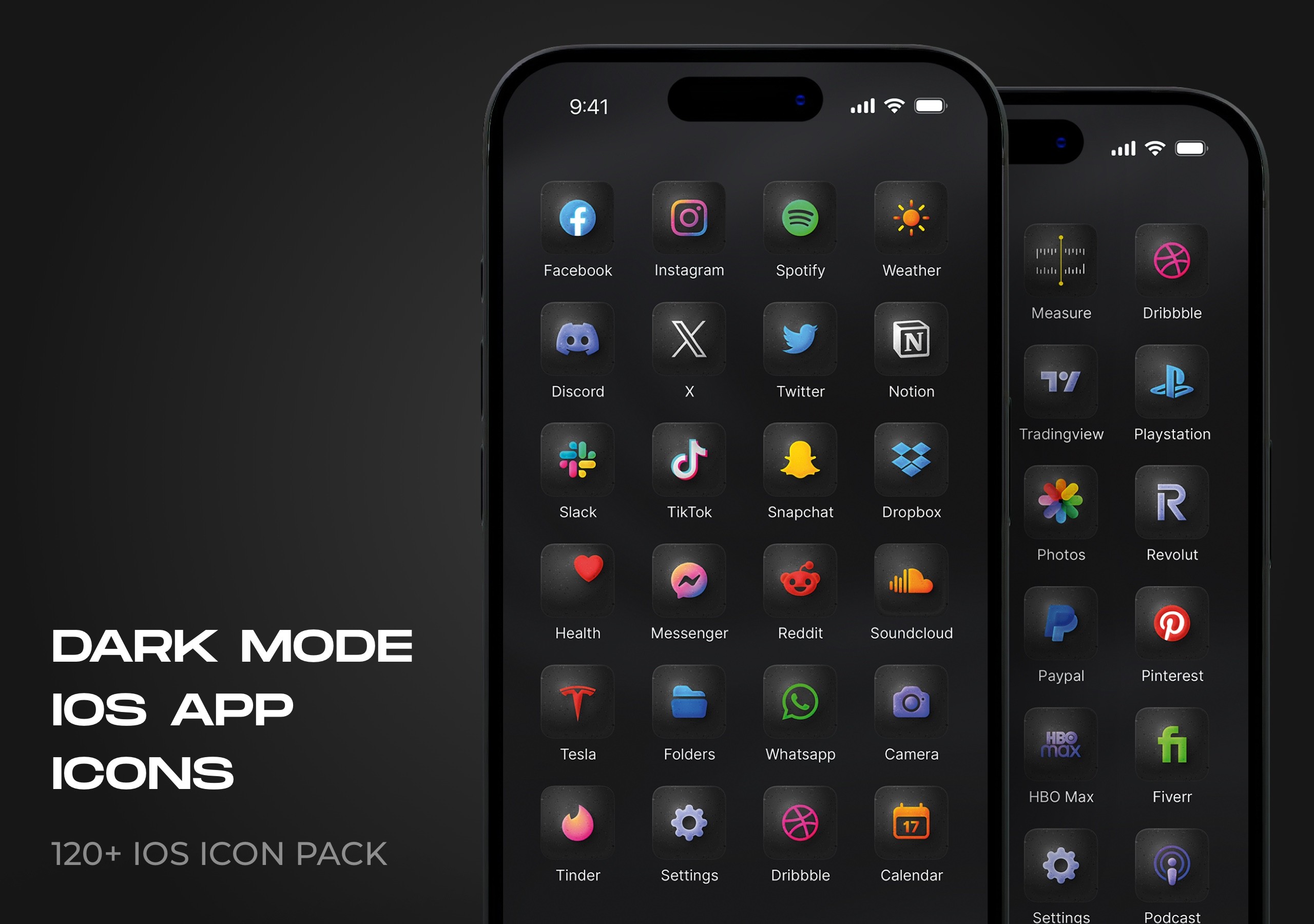
Implementing a well-designed dark theme requires more than simply inverting colors. It involves a comprehensive understanding of color theory, typography, and user interface patterns. Developers must select appropriate color palettes that maintain readability and accessibility while adhering to brand guidelines. This often involves using desaturated colors, muted tones, and avoiding pure black, which can cause "haloing" effects around bright text on OLED screens. Instead, deep grays and blues are often preferred. Typography needs careful consideration, ensuring sufficient contrast with the dark background without appearing too harsh or washed out. Font weights and sizes may need to be adjusted to optimize legibility. Furthermore, maintaining consistency in the dark theme across all elements of the app is crucial for a cohesive user experience. This includes icons, images, and any custom UI components. Many design systems now include dark mode specifications, making it easier for developers to implement consistent and visually appealing dark interfaces. For example, Apple’s Human Interface Guidelines provide comprehensive advice on designing for both light and dark appearances, emphasizing the need for adaptable color palettes and elevation principles. The transition between light and dark modes should also be smooth and intuitive, often implemented via a system-wide setting that the app respects. This allows users to have a consistent experience across their device, regardless of the app they are using. The goal is to create a dark theme that feels intentional and well-crafted, rather than an afterthought.
The evolution of dark themes has also been driven by user demand and the increasing awareness of its benefits. Many users now expect dark mode as a standard feature in their apps, and its absence can be a point of dissatisfaction. The widespread adoption of dark mode by major operating systems, including iOS and Android, has normalized its usage and raised user expectations. For businesses and app developers, offering a well-implemented dark theme can be a competitive advantage, signaling a commitment to user experience and modern design principles. It can also be a factor in app store ratings and reviews, with users often praising apps that offer thoughtful dark mode support. The ability to cater to diverse user needs and preferences is increasingly becoming a differentiator in the crowded app market. Moreover, the design community has embraced dark themes, leading to a wealth of inspiration and best practices. Designers and developers can learn from successful implementations and adapt them to their own projects. This collective knowledge sharing has accelerated the quality and sophistication of dark themes in iOS apps. The trend is likely to continue to evolve, with further innovations in color science, accessibility standards, and display technology influencing how dark themes are designed and implemented in the future.
In conclusion, dark themes in iOS apps are no longer a niche preference but a fundamental aspect of modern application design. They offer a compelling combination of aesthetic appeal, enhanced accessibility for a diverse user base, and significant performance benefits, particularly in terms of battery life on OLED devices. Developers who prioritize the thoughtful implementation of dark themes are not only meeting user expectations but also contributing to a more inclusive, comfortable, and efficient digital experience. The continued evolution of design principles and display technologies will undoubtedly further solidify the importance of dark themes in the iOS ecosystem, making them an indispensable feature for any well-designed application.
