Creating clean edits in a color story is an art form that takes practice and understanding. It’s not just about making your images look pretty; it’s about using color to tell a story, evoke emotions, and create a cohesive visual experience.
This involves understanding the fundamentals of color harmony, mastering color grading techniques, and utilizing color to convey meaning and symbolism.
In this post, we’ll explore these concepts and delve into the tools and techniques that can help you achieve clean and impactful color edits in your work. Whether you’re a photographer, filmmaker, or graphic designer, mastering color can elevate your creative output and make your visuals truly stand out.
Understanding Color Harmony: Creating Clean Edits In A Color Story

Color harmony is a fundamental principle in visual design that refers to the pleasing and aesthetically balanced combination of colors. It’s the art of creating a harmonious visual experience by carefully selecting and arranging colors to create a sense of unity, coherence, and visual appeal.
Understanding color harmony is essential for creating clean and aesthetically pleasing edits in color stories, as it helps to guide the viewer’s eye, evoke emotions, and enhance the overall impact of the visual narrative.
Complementary Colors
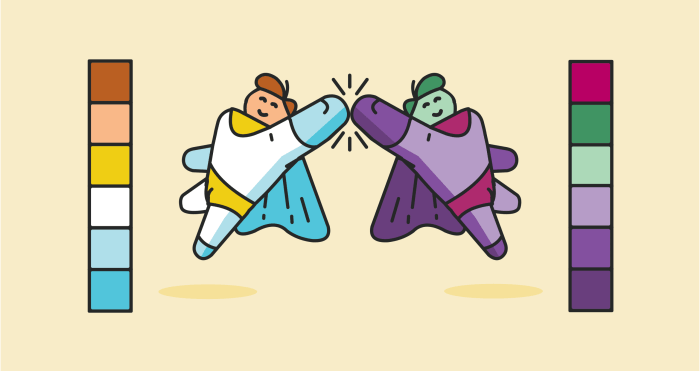
Complementary colors are pairs of colors that sit opposite each other on the color wheel. These colors create a high contrast and visual excitement when placed next to each other. They can also be used to create a sense of depth and dimension.
- Examples of complementary color pairs include red and green, blue and orange, and yellow and purple.
- In a color story, complementary colors can be used to create a sense of drama and excitement, especially when used in a limited palette.
Analogous Colors
Analogous colors are groups of three colors that sit next to each other on the color wheel. They create a sense of harmony and unity because they share similar hues.
- Examples of analogous color schemes include blue, blue-green, and green, or yellow, yellow-orange, and orange.
- Analogous colors can be used to create a sense of calm and tranquility, making them suitable for creating a soothing and cohesive visual experience.
Triadic Colors, Creating clean edits in a color story
Triadic colors are groups of three colors that are equally spaced on the color wheel. They create a sense of balance and visual interest.
- Examples of triadic color schemes include red, yellow, and blue, or green, orange, and purple.
- Triadic colors can be used to create a sense of vibrancy and energy, making them ideal for creating visually stimulating and memorable color stories.
Monochromatic Colors
Monochromatic colors are different shades, tints, and tones of a single color. They create a sense of simplicity and elegance.
- Examples of monochromatic color schemes include various shades of blue, green, or red.
- Monochromatic colors can be used to create a sense of sophistication and focus, making them suitable for creating a clean and minimalist visual experience.
Color Grading Techniques

Color grading is the art of manipulating the color and tone of an image or video to achieve a specific aesthetic or enhance the overall visual story. It’s a powerful tool that can be used to create a cohesive look, evoke emotions, and emphasize certain elements within the frame.
Color Correction
Color correction is the process of adjusting the colors in an image or video to ensure that they are accurate and consistent. This involves correcting for any color casts, such as a blue or orange tint, and ensuring that the white balance is correct.
“Color correction is the foundation of color grading, and it’s essential to get it right before you start making any creative adjustments.”
Color correction techniques can be used to:* Fix color casts:If an image has a color cast, it means that the colors are not accurate. For example, an image that was shot under fluorescent lights may have a green color cast. Color correction can be used to remove these color casts and make the colors appear more natural.
Adjust white balance
White balance refers to the color temperature of the light source used to capture the image. By adjusting the white balance, you can ensure that the white objects in the image appear white and not yellow or blue.
Adjust exposure
Exposure refers to the amount of light that hits the camera sensor. Color correction can be used to adjust the overall brightness or darkness of the image.
Color Balancing
Color balancing is the process of adjusting the colors in an image or video to create a specific mood or atmosphere. This can involve adjusting the saturation, contrast, and brightness of the colors.
“Color balancing is about creating a specific look and feel for your image or video. It’s a more creative process than color correction.”
Color balancing techniques can be used to:* Enhance the mood:For example, a film set in a dark and mysterious setting might benefit from a color balance that emphasizes dark blues and purples.
Create a sense of realism
If you’re editing a documentary, you might want to use a color balance that is true to life.
Highlight specific elements
Color balancing can be used to draw attention to certain objects or areas in the image.
Selective Color Adjustments
Selective color adjustments allow you to target specific colors in an image or video and adjust their hue, saturation, and luminance. This is a powerful technique that can be used to create subtle or dramatic changes in the overall look of the image.
“Selective color adjustments are like a paintbrush for your image or video. You can use them to add a touch of color or completely transform the look of the image.”
Selective color adjustments can be used to:* Create a vintage look:By desaturating all colors except for one, you can create a vintage or faded look.
Highlight a specific object
By increasing the saturation of a specific color, you can draw attention to that object.
Create a dramatic effect
By adjusting the hue and saturation of a color, you can create a dramatic effect.
Creating clean edits in a color story is all about achieving that perfect balance, just like when you’re making a batch of caramel. You want each color to stand out, but also blend seamlessly together. And just like you can’t rush a good caramel, you can’t rush the editing process.
So take your time, experiment with different hues, and remember, a little patience goes a long way, especially if you’re trying out a recipe like try this crockpot caramel ! Once you’ve got your color story dialed in, you’ll be amazed at how much richer and more impactful your final product will be.
Creating clean edits in a color story is all about finding that perfect balance. Sometimes, a pop of unexpected color can really make a design sing, like those adorable animal designs on wrapping paper you can find here.
But remember, even the cutest animal patterns can get lost in a sea of clashing hues. So, be mindful of your color choices and let your edits tell a cohesive story.
When creating clean edits in a color story, it’s crucial to maintain a sense of elegance and sophistication. Think of how a delicate pearl necklace can elevate an outfit – it’s all about subtle details that make a big impact.
Check out Butler Wilson’s enchanting pearl jewelry collection for luxurious beauty and style for inspiration on how to add that touch of refined glamour to your color story. Just like those pearls, a few well-placed edits can transform your color story into a masterpiece.

