
Unlock Your Creative Potential: A Comprehensive Guide to Color Block Mood Boards
Color blocking, a dynamic design technique that utilizes distinct blocks of solid, often contrasting colors, has transcended its fashion origins to become a powerful visual language across numerous creative disciplines. A color block mood board is not merely a collection of swatches; it’s a strategic assembly of color palettes, textures, and imagery that embodies a specific mood, aesthetic, or concept. This comprehensive guide will delve into the multifaceted world of color block mood boards, exploring their creation, application, and SEO optimization, empowering you to leverage their impact for your own creative projects.
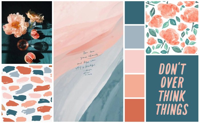
At its core, a color block mood board serves as a visual blueprint, a tangible representation of an idea communicated primarily through color. Unlike traditional mood boards that might lean heavily on photography and illustration, a color block approach prioritizes the impact of hue, saturation, and value. The "blocks" can range from broad swathes of color to precisely defined geometric shapes, each contributing to the overall narrative. The power of this method lies in its directness. Color is inherently emotive; it elicits psychological responses and associations. By strategically juxtaposing colors in distinct blocks, you can instantly convey a feeling, a brand personality, or a design direction. This is particularly effective in the initial stages of a project, where rapid communication of a visual concept is paramount. Think of it as a shortcut to understanding the emotional resonance of your design.
Creating an effective color block mood board begins with a clear objective. What is the intended outcome? Are you developing a brand identity? Designing a website? Curating an interior design scheme? Planning a fashion collection? The purpose will dictate the selection of colors and accompanying elements. Once the objective is established, the process involves identifying key color families that align with the desired mood. For instance, a calming spa aesthetic might lean towards muted blues, greens, and soft grays, presented in large, harmonious blocks. Conversely, a high-energy athletic brand might embrace vibrant reds, oranges, and electric blues, arranged in bold, intersecting forms. The principle of contrast is crucial here. While harmonious palettes create a sense of unity, strategic contrast can add visual interest, dynamism, and highlight specific elements. Consider complementary colors (opposite each other on the color wheel), analogous colors (next to each other), or triadic colors (evenly spaced) as starting points for your block arrangements.
Beyond the pure color swatches, the inclusion of textures and supporting imagery is vital. While color is the protagonist, texture adds depth and tactility. A rough linen texture paired with a deep navy block can evoke a sense of artisanal craftsmanship, while a sleek metallic sheen adjacent to a bold yellow block might communicate modernity and innovation. These textural elements should be chosen to complement, not compete with, the primary colors. Similarly, carefully selected imagery can provide context and further solidify the mood. This imagery might include abstract shapes that echo the color blocking, or representational elements that embody the brand’s essence or the project’s theme. For example, a color block mood board for a sustainable fashion line might feature blocks of earthy greens and browns, alongside images of natural fibers, organic textures, and perhaps subtle hints of recycled materials.
The application of color block mood boards is remarkably diverse. In graphic design and branding, they are invaluable for defining a brand’s visual identity. A consistent color block palette can be translated across logos, websites, marketing materials, and packaging, creating a strong and recognizable brand presence. For web designers, color block layouts offer a modern and visually engaging approach to content organization. Large blocks of color can delineate sections, highlight calls to action, and break up monotonous layouts, improving user experience and readability. In interior design, color block mood boards are instrumental in communicating a desired ambiance. They help clients visualize how bold color choices will interact within a space, guiding furniture selection, paint colors, and accent pieces. The fashion industry has long embraced color blocking, and mood boards dedicated to this technique help designers explore avant-garde combinations and create cohesive collections. Even in fields like photography and videography, color block principles can inform shot composition and color grading, leading to visually striking and intentional aesthetics.
For SEO optimization, the term "color block mood board" itself is a valuable keyword. However, to truly rank and attract your target audience, a deeper dive into related and long-tail keywords is essential. Consider terms like "modern color palette inspiration," "bold color blocking design," "creative mood board ideas," "psychology of color in design," "how to create a color block mood board," "color blocking for branding," "interior design color blocking," and "fashion color block trends." Integrating these keywords naturally within your content, especially in headings, subheadings, image alt text, and the body of your article, will significantly improve your search engine visibility. Furthermore, creating high-quality, informative content around these keywords will attract backlinks from other relevant websites, further boosting your SEO authority.
The structure of your content is also critical for SEO. Employing clear headings and subheadings (H2, H3, etc.) breaks up your text, making it more scannable for both readers and search engine crawlers. This allows search engines to better understand the hierarchy and key topics within your article. For instance, you might have an H2 titled "The Psychological Impact of Color Blocks" and then an H3 under that titled "Warm Colors and Energy" or "Cool Colors and Serenity." This structured approach not only enhances readability but also signals relevance to search engines.
Image optimization is another crucial aspect of SEO for a topic like color block mood boards, where visuals are paramount. When uploading images to your website or platform, ensure that you use descriptive file names (e.g., bold-blue-and-orange-color-block-mood-board.jpg instead of IMG_1234.jpg). Crucially, fill out the alt text attribute for each image with a concise yet descriptive summary of the image’s content, incorporating relevant keywords. For example, alt="Vibrant color block mood board featuring energetic oranges, deep blues, and contrasting geometric shapes for a modern brand identity" is far more beneficial than alt="mood board". This not only helps search engines understand the image’s content but also improves accessibility for visually impaired users.
Internal linking is a powerful yet often overlooked SEO strategy. As you create content related to color, design, or mood boards, link back to this comprehensive guide on color block mood boards. This helps distribute link equity throughout your website and keeps users engaged by offering them additional relevant resources. Similarly, external links to reputable sources, such as color theory websites, design blogs, or industry publications, can also lend credibility to your content.
The act of creating a color block mood board is inherently iterative. Don’t be afraid to experiment. Start with broad strokes and then refine. Consider the balance of colors – is there too much of one hue? Does the contrast feel jarring or intentional? Does the overall composition evoke the intended emotion? Tools ranging from physical swatches and magazines to sophisticated digital design software can be employed. For digital creation, platforms like Adobe Photoshop, Illustrator, Canva, or even Pinterest can be utilized. The key is to translate your abstract ideas into a tangible, visually coherent representation.
When discussing the "mood" aspect, it’s important to recognize that color psychology plays a significant role. Different colors evoke distinct emotions and associations. Red, for example, can signify passion, energy, or danger. Blue often communicates calmness, trust, or stability. Yellow can represent happiness, optimism, or caution. Green is frequently linked to nature, growth, and health. Purple can suggest luxury, creativity, or spirituality. Understanding these associations allows you to deliberately select colors that will communicate the precise mood you intend for your project. A color block mood board becomes a powerful tool for communicating not just an aesthetic, but an emotional experience.
The longevity of a color block mood board as a design tool is undeniable. Its simplicity and directness make it universally understandable, and its adaptability allows it to be applied across a vast spectrum of creative endeavors. As design trends evolve, the core principles of color theory and visual composition that underpin effective color blocking remain constant. Therefore, mastering the art of the color block mood board is an investment in a versatile and enduring creative skill. Whether you are a seasoned designer seeking to refine your process or a budding creative looking for a structured approach to visual communication, the color block mood board offers a powerful and impactful solution. Its ability to distill complex ideas into easily digestible visual statements makes it an indispensable asset in the modern creative toolkit. By understanding its principles, embracing its versatility, and optimizing your content around it, you can unlock a new level of creative clarity and achieve greater resonance with your audience.
