
DIY Watercolor Phrase Art: Unleash Your Inner Calligrapher and Artist
Watercolor phrase art is a captivating blend of artistic expression and meaningful typography. It allows individuals to transform simple words and quotes into visually stunning pieces of decor, gifts, or personal affirmations. This DIY guide delves into the process, materials, techniques, and creative possibilities of crafting your own watercolor phrase art. Whether you’re a seasoned artist or a complete beginner, this comprehensive resource will equip you with the knowledge to embark on your watercolor lettering journey.
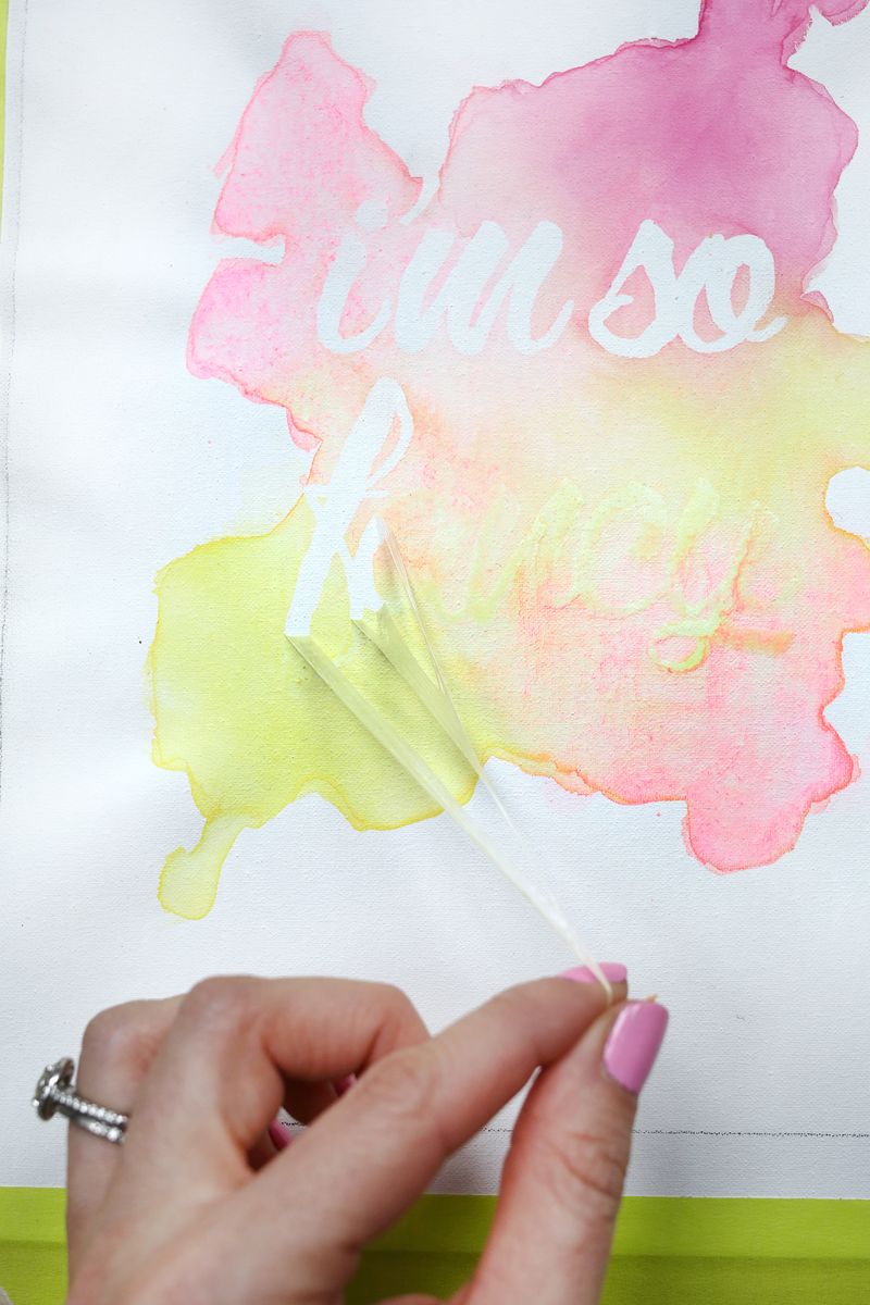
The foundation of any successful DIY watercolor phrase art project lies in selecting the right materials. For watercolors, a beginner set of pan watercolors will suffice. These are water-soluble pigments compressed into solid cakes, activated by water. As you progress, you might consider tube watercolors, which offer a richer pigment intensity and a wider color palette. The choice of paper is equally crucial. Watercolor paper is specifically designed to handle water without buckling or tearing. Look for cold-press watercolor paper, which has a textured surface ideal for holding pigment and creating beautiful washes. The weight of the paper, measured in pounds or grams per square meter (gsm), is also important; 140lb (300gsm) is a good standard weight for most watercolor techniques. You’ll also need a few different sizes and shapes of round watercolor brushes. A small, fine-tipped brush is essential for detailed lettering, while larger brushes are useful for creating washes and background effects. A palette for mixing your watercolors, a jar of clean water, paper towels for blotting excess water, and a pencil for sketching your design are also indispensable. For the "phrase art" component, consider your lettering style. You can opt for pre-made stencils if you’re new to lettering, or embrace freehand calligraphy using dip pens with ink or even brush pens that mimic the look of watercolor. For those interested in a truly watercolor-centric approach, you can paint your letters directly with watercolors, controlling the thickness and flow of the pigment to create variations in line weight.
Choosing the right phrase or quote is the soul of your watercolor phrase art. This is where personalization and intention come into play. Think about what message you want to convey. It could be an inspirational quote that uplifts you, a favorite lyric that resonates deeply, a witty saying that brings a smile, or a significant date or name. Consider the length of the phrase; shorter, impactful phrases often work best for visual art, allowing ample white space and focusing attention on the lettering. For longer quotes, you might need to break them down into sections or select only the most essential words. Brainstorming can involve looking through books of quotes, browsing online inspiration boards like Pinterest, or simply reflecting on your personal experiences and values. Once you have a few potential phrases, consider how they will translate visually. Do certain words lend themselves to a particular artistic interpretation? For example, a phrase about the ocean might inspire blue hues and wave-like brushstrokes.
Sketching your design is a critical pre-painting step. This allows you to experiment with layout, lettering styles, and composition without committing to paint. Using a light pencil, lightly sketch the words on your watercolor paper. Don’t worry about perfection at this stage; this is a draft. Experiment with different fonts and letter sizes. Consider how the words will flow across the page. Will they be arranged in a straight line, a curve, or a more organic shape? Think about the negative space around the words, as this is just as important as the words themselves in creating a balanced and aesthetically pleasing composition. You can also lightly sketch in any planned watercolor effects, such as areas for washes or gradients. This initial sketch is your blueprint, guiding your brushstrokes and ensuring your final piece aligns with your vision. Remember to keep your pencil lines light, as dark pencil marks can be difficult to cover with watercolor and may show through.
The act of painting the letters is where the magic of watercolor phrase art truly unfolds. For beginners, it’s often easiest to start with a simple, bold font. Dip your fine-tipped brush into water, then load it with pigment from your watercolor palette. Practice on a scrap piece of paper first, getting a feel for the amount of water to pigment ratio. Too much water will result in a faint, washed-out letter, while too little will make the pigment thick and difficult to control. For brush lettering, the principle of pressure is key. Apply light pressure for thin upstrokes and heavier pressure for thick downstrokes, creating the characteristic contrast that defines calligraphy. Experiment with varying the pressure as you move across the paper. You can also explore different watercolor techniques to enhance your letters. Consider adding a subtle wash of color behind the letters for depth, or using a wet-on-wet technique to create soft, blended edges. For a more dramatic effect, try a dry brush technique, where you use a brush with very little water and pigment to create textured, broken lines. Don’t be afraid to layer colors. Allow the first layer of paint to dry completely before applying subsequent layers for opaque coverage or to build up richer tones.
Adding watercolor backgrounds and embellishments elevates your phrase art from simple lettering to a complete artistic composition. Once your letters are dry, you can begin working on the background. Washes are a classic watercolor technique that can create beautiful, diffused color fields. To create a wash, wet a large area of your paper with clean water, then apply your chosen watercolor pigment to the wet surface. The color will spread and blend naturally, creating a soft, ethereal effect. You can also create graded washes by gradually adding more water to your pigment as you move across the paper, resulting in a smooth transition of color. Experiment with different color combinations. Complementary colors, when placed next to each other, create visual vibrancy. Analogous colors, which are next to each other on the color wheel, create a harmonious and calming effect. For a more textured background, you can use a salt technique. Sprinkle coarse salt onto a wet watercolor wash. As the salt dries, it will absorb some of the pigment, creating unique crystalline patterns. Other embellishments could include subtle splatters of ink or paint for an energetic feel, delicate floral illustrations around the text, or even metallic accents with gold or silver watercolors.
Sealing and framing your watercolor phrase art ensures its longevity and presentation. Once your artwork is completely dry, it’s a good idea to protect it. For pieces that will be handled frequently or displayed in direct sunlight, a spray sealant designed for watercolor can offer protection against fading and moisture. Apply it in light, even coats in a well-ventilated area. Framing is the final step in showcasing your creation. The right frame can enhance your artwork and make it a striking addition to any decor. Consider the style of your artwork and the environment it will be displayed in. A simple, minimalist frame can let the watercolor speak for itself, while a more ornate frame can add a touch of elegance. Matting is also an important consideration. A mat creates a border around your artwork, separating it from the frame and making the piece appear larger and more prominent. Choose a mat color that complements your watercolor. For archival framing, which is essential for preserving your artwork, use acid-free mat board and backing materials. UV-protective glass can also help prevent fading from sunlight.
Exploring different lettering styles is key to developing your unique voice in watercolor phrase art. Beyond the basic brush lettering, consider modern calligraphy, which often features a more fluid and expressive style. Dip pen calligraphy, while traditionally done with ink, can be adapted for watercolor by diluting ink or using specialized watercolor inks. Copperplate and Spencerian scripts offer a more traditional, elegant aesthetic, requiring significant practice to master. For a more organic and free-spirited look, consider watercolor lettering where the letters themselves are painted with various watercolor techniques, such as layered washes, dry brush textures, or even watercolor pencils for more defined lines. Typography research can be incredibly beneficial; study different fonts and how they are constructed. Understanding the anatomy of letters – the ascenders, descenders, serifs, and sans-serifs – will help you replicate or adapt them more effectively in your watercolor creations. Don’t be afraid to experiment with blending different styles within a single piece. Perhaps a bold, modern font for the main phrase, with delicate script for an accompanying word or date.
The potential applications for DIY watercolor phrase art are vast and inspiring. Beyond personal enjoyment, these creations can be thoughtful and unique gifts for birthdays, holidays, anniversaries, or just because. Imagine a personalized affirmation painted for a friend who needs encouragement, or a heartfelt quote for a wedding. They can be incorporated into scrapbooking projects, used as decorative elements in journals, or even digitized and printed onto greeting cards or other stationery. Consider creating a series of pieces with a unifying theme or color palette to decorate a gallery wall. For small businesses or individuals offering custom services, watercolor phrase art can be a beautiful way to brand their offerings. The tactile and artistic nature of watercolor adds a level of warmth and authenticity that digital designs often lack. Furthermore, the process itself is incredibly therapeutic and rewarding, offering a mindful escape from the everyday.
To optimize your DIY watercolor phrase art for search engines, focus on incorporating relevant keywords naturally throughout your content. Keywords such as "DIY watercolor phrase art," "watercolor lettering," "how to paint quotes," "calligraphy tutorial," "watercolor gift ideas," and "artistic typography" should be woven into headings, subheadings, and the body of the text. High-quality images are crucial for SEO and user engagement. Ensure your images are well-lit, clearly showcase your work, and are optimized for web use (compressed file sizes). Descriptive alt text for your images, using relevant keywords, will help search engines understand the content of your images. Social media sharing is also vital. Encourage readers to share their creations using specific hashtags related to watercolor phrase art. Building backlinks from other art blogs or craft websites can also boost your SEO. Engaging with your audience through comments and social media interactions will foster a community and increase your visibility. Remember that consistent, valuable content creation is key to long-term SEO success.
Troubleshooting common watercolor issues is an important part of the DIY process. Buckling paper is a frequent concern. This can be mitigated by using heavier weight watercolor paper (140lb or more), stretching your paper before painting (a technique involving soaking and taping the paper to a board), or by using a watercolor block, which is paper glued on all four sides. Colors not blending smoothly can often be attributed to the paper being too dry. Ensure you’re working with sufficiently wet paper or a wet brush for smooth transitions. Streaky or uneven washes can occur if you’re not applying the water or pigment evenly. Practice creates consistency. If your lettering looks wobbly or inconsistent, it’s likely a matter of brush control and pressure. Dedicate time to practicing fundamental brush strokes on scrap paper. Overworking the paint can lead to muddy colors. Allow layers to dry before applying new ones, and avoid excessive scrubbing. If you make a mistake, don’t despair. Sometimes, a small "oops" can be incorporated into the design, or you can gently lift excess color with a clean, damp brush or a paper towel. For more significant errors, it’s often best to start a fresh piece with the lessons learned from your previous attempt.
Developing a personal style in watercolor phrase art is an ongoing journey of experimentation and self-discovery. It’s about finding what excites you and what resonates with your artistic sensibilities. This might involve favoring a particular color palette, a specific lettering style, or a unique way of incorporating illustrative elements. Pay attention to the artists whose work you admire and try to understand what draws you to their pieces. Is it their use of color, their line work, their composition? Don’t be afraid to borrow elements and techniques from them, but always strive to make them your own. Keep a sketchbook dedicated to exploring different ideas, color combinations, and lettering styles. Document your progress and reflect on what you enjoy creating most. Your style will evolve over time as you gain more experience and confidence. The most important thing is to have fun with the process and allow your creativity to flow without self-imposed limitations. Embrace the imperfections; they often add character and charm to handmade art.
The artistic and therapeutic benefits of creating DIY watercolor phrase art are undeniable. The act of painting itself is a form of mindfulness, encouraging focus and presence. The gentle rhythm of brushstrokes, the blending of colors, and the careful formation of letters can be incredibly calming and stress-reducing. It provides an outlet for self-expression, allowing individuals to translate their thoughts and emotions into tangible artwork. The satisfaction of completing a piece, of bringing a quote to life through your own hands, is immensely rewarding. It fosters a sense of accomplishment and boosts self-esteem. Furthermore, the process of learning and improving a new skill, like watercolor lettering, is intellectually stimulating and engaging. It encourages patience, persistence, and a willingness to embrace challenges. The final artwork not only serves as a beautiful decorative item but also as a constant reminder of your creative journey, your chosen words, and the peaceful moments you invested in its creation.
