
The Perpetual Muse: How My Mood Board Fuels Creativity and Overcomes Creative Block
The genesis of an idea, the refinement of a concept, or simply the daily battle against a blank canvas – these are the arenas where inspiration is most desperately needed. For me, the most potent and reliable source of this vital spark isn’t a fleeting thought or a serendipitous encounter, but a meticulously curated and constantly evolving physical entity: my mood board. More than just a collection of images, it’s a tangible manifestation of my aesthetic sensibilities, a repository of visual language, and a dynamic tool that actively combats creative stagnation. This isn’t a static display; it’s a living document, a testament to the power of visual curation in fostering sustained inspiration. It serves as a constant reminder of the directions I want to explore, the emotions I aim to evoke, and the visual vocabulary that resonates with my creative soul. Its presence is a silent, yet powerful, catalyst, transforming amorphous thoughts into concrete directions and providing a much-needed anchor in the often-turbulent waters of the creative process.
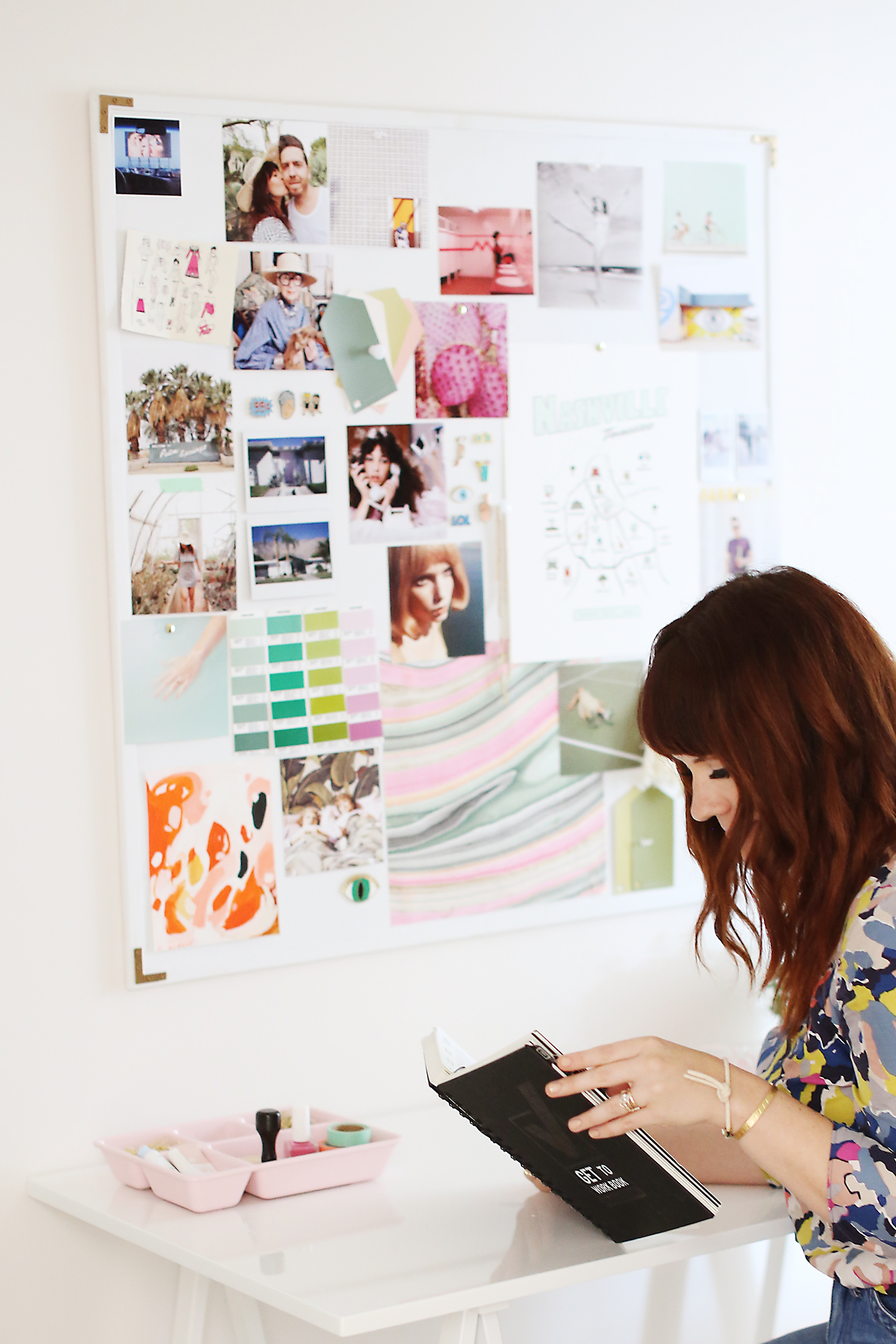
At its core, my mood board functions as a highly personalized visual database. It’s a carefully constructed tapestry woven from a diverse array of elements: torn magazine pages, printed photographs, fabric swatches, color chips, handwritten notes, even small found objects. The selection process is intuitive yet deliberate. I’m drawn to images that possess a certain quality, an intangible energy that speaks to me. This might be the interplay of light and shadow in a photograph, the texture of a particular fabric, the bold graphic design of a poster, or the evocative atmosphere of a film still. These elements aren’t chosen for their literal representation of a project, but for their thematic resonance, their emotional impact, or their inherent aesthetic appeal. Over time, patterns emerge. Recurring color palettes, specific types of imagery, and even certain compositional styles begin to appear, revealing underlying themes and preferences that might otherwise remain subconscious. This ongoing self-discovery is a crucial aspect of the mood board’s inspirational power, allowing me to identify and leverage my own aesthetic inclinations. The physical act of cutting, pasting, and arranging also grounds the creative process, moving it from the ephemeral realm of digital screens into a tactile, tangible experience. This physical engagement fosters a deeper connection with the visual elements, making them more memorable and impactful.
The true strength of my mood board lies in its ability to provide immediate visual anchors when creative inspiration falters. When faced with a creative block, rather than staring blankly at a screen or a canvas, I can turn to my board. The sheer volume of curated visuals acts as a cognitive jumpstart. My eyes scan the arranged elements, and within moments, a connection is made, a spark ignites. It could be a specific color combination that suggests a new direction, a texture that hints at a material to explore, or an entire composition that unlocks a narrative. This immediate visual stimulus bypasses the often-frustrating analytical part of the brain and taps directly into the more intuitive, associative areas. It’s like a visual shorthand for complex ideas, allowing me to access a wealth of potential solutions and avenues of exploration without the need for extensive verbal articulation. The board acts as a prompt, a gentle nudge, or sometimes, a forceful push in a new direction, depending on the depth of the creative impasse. This accessibility is key; it’s not a tool that requires significant effort to engage with, making it an invaluable resource for immediate problem-solving.
Beyond simply offering solutions, my mood board acts as a constant reminder of my overarching aesthetic vision and the emotional landscape I aim to cultivate. It’s a visual manifesto that articulates the "why" behind my creative pursuits. When I feel myself drifting towards generic or uninspired territory, a glance at the board pulls me back to my core values and intentions. It reinforces the kind of atmosphere I want to create, the feelings I want to evoke, and the unique perspective I bring to my work. This consistent reinforcement is crucial for maintaining authenticity and preventing creative compromise. It helps me to distinguish between fleeting trends and enduring stylistic principles. The curated elements represent a deliberate choice, a distillation of what I find beautiful, compelling, and meaningful. This deliberate selection process imbues the board with a personal narrative, a visual autobiography of my creative journey. It’s a constant dialogue between my past inspirations and my future aspirations, a bridge that ensures my current work remains grounded in my evolving artistic identity.
The dynamic nature of my mood board is as critical to its inspirational power as its content. It is not a static shrine to past ideas, but a living, breathing entity that evolves with my understanding and exploration. I constantly add new images, re-arrange existing ones, and sometimes, even remove elements that no longer resonate. This process of revision and refinement is an integral part of the creative journey. It reflects my growth as an artist, my shifting interests, and my deepening understanding of the world around me. This constant flux ensures that the board remains relevant and continues to challenge and inspire me. It prevents it from becoming stale or predictable. The act of curating and re-curating is a form of active learning and critical thinking. It forces me to evaluate what still holds significance and what has been superseded by new insights or discoveries. This iterative process ensures that the mood board is always pushing me forward, encouraging me to consider new perspectives and integrate fresh influences.
Color palettes are a particularly potent element on my mood board, serving as foundational building blocks for much of my creative output. I meticulously gather color chips, fabric swatches, and magazine clippings that exhibit specific chromatic harmonies or striking juxtapositions. These aren’t just arbitrary color choices; they are carefully selected to evoke particular moods, emotions, or even abstract concepts. A vibrant, earthy palette might speak of groundedness and natural beauty, while a cool, muted spectrum could signal introspection and serenity. When I’m struggling to define the emotional tone of a project, I can simply look to the color sections of my board for immediate guidance. The interplay of these colors often suggests potential combinations for projects, influencing everything from website design and branding to interior decoration and even fashion choices. The physical presence of these color palettes provides a tactile and visual anchor, making them more impactful than simply observing digital color swatches. This immediate access to a curated spectrum of emotions, translated into color, is an invaluable tool for setting the desired atmosphere and ensuring a cohesive aesthetic.
Texture plays an equally significant role in my mood board’s inspirational arsenal. The tactile experience of different materials is a powerful sensory input that can unlock new avenues of creativity. I include fabric swatches with varied weaves and finishes, samples of rough paper, smooth metal, or even natural elements like dried leaves or sand. The visual representation of texture is often captivating, but the physical sensation, when I reach out and touch these elements, provides a deeper, more visceral connection. This can inspire the use of specific materials in a project, inform the design of physical products, or even influence the way I approach digital rendering to mimic certain tactile qualities. The juxtaposition of smooth and rough, matte and glossy, allows for the exploration of contrasting sensory experiences, which can add depth and complexity to my work. The physical presence of these textures is crucial, as it allows for a multi-sensory engagement with my inspiration, going beyond mere visual appeal to encompass a more immersive and evocative experience.
Typography is another key component that informs my creative direction. I gather examples of fonts that possess distinct personalities – elegant serifs, bold sans-serifs, playful scripts, or utilitarian mono-spaced designs. These typographic choices are not merely about legibility; they are about character, tone, and the subtle messages they convey. A dramatic display font might speak of grandeur and sophistication, while a clean, minimalist typeface can convey clarity and modernity. When developing branding or designing layouts, my mood board provides an instant library of typographical inspiration, helping me to select fonts that align with the intended message and aesthetic. The visual impact of carefully chosen typography can significantly influence the overall feel and effectiveness of a design. By including diverse typographic examples, my mood board allows me to explore the vast spectrum of visual communication and select the most impactful ways to convey information and evoke emotion through the written word.
The process of curating and maintaining my mood board is inherently a process of self-reflection and discovery. Each image, each swatch, each word represents a conscious or subconscious choice, a piece of my personal aesthetic puzzle. By regularly reviewing and re-arranging these elements, I gain deeper insights into my own creative drivers, my recurring themes, and my evolving tastes. This ongoing introspection is vital for ensuring that my work remains authentic and deeply personal. It allows me to identify and lean into my unique strengths and perspectives, rather than simply imitating external trends. The mood board acts as a mirror, reflecting not just what I find inspiring, but also who I am as a creative individual. This continuous self-awareness is the bedrock upon which sustained and meaningful creative output is built. It’s a tool that not only facilitates the creation of external projects but also fosters profound internal growth and understanding.
In essence, my mood board is far more than a static collection of inspirational images; it is a dynamic, multi-sensory, and deeply personal tool that actively fuels my creativity. It serves as an immediate visual anchor, a constant reminder of my aesthetic intentions, a repository of diverse visual language, and a catalyst for self-discovery. By embracing the physical, tactile, and curated nature of this evolving entity, I am equipped to navigate the challenges of creative block, to refine my artistic vision, and to consistently produce work that is both authentic and compelling. It is my perpetual muse, a tangible testament to the enduring power of curated inspiration in the relentless pursuit of creative excellence. Its presence is a silent promise of possibility, a constant invitation to explore, innovate, and create.
