
Choosing a Color Story for Your Home: A Comprehensive Guide
Selecting a color story for your home is more than just picking paint swatches; it’s about curating an atmosphere, reflecting personality, and enhancing the functionality of your living spaces. A well-defined color story creates cohesion, making rooms feel intentional and inviting. It involves understanding color theory, considering the mood you wish to evoke, and harmonizing elements like furniture, art, and decor. This comprehensive guide will walk you through the process of choosing a color story that resonates with you and transforms your home into a sanctuary.
The foundation of any successful color story lies in understanding color theory. Colors are broadly categorized into warm colors (reds, oranges, yellows) and cool colors (blues, greens, purples). Warm colors are energetic and stimulating, often making spaces feel cozy and intimate. Cool colors are calming and serene, typically creating an expansive and tranquil feel. Neutrals (whites, grays, beiges, blacks) serve as the backbone, providing balance and versatility. Their undertones are crucial; a gray with a blue undertone will feel different from a gray with a green undertone. Understanding these basic principles allows for intentional color pairings. For instance, combining a warm color with its complementary color (opposite on the color wheel) creates high contrast and visual excitement, while analogous colors (adjacent on the color wheel) offer a harmonious and soothing effect.
Begin by analyzing the existing elements in your home. Look at your furniture, flooring, large rugs, and any significant artwork. These are likely to be more permanent fixtures than wall paint, so they should heavily influence your color choices. Identify the dominant colors and any secondary or accent colors present in these items. Do you have a navy sofa with cream accents? A Persian rug with deep reds and blues? These existing colors can provide a starting point for your color story. If your furniture is largely neutral, you have more freedom to experiment with bolder color choices for walls and accessories. Conversely, if your existing pieces are richly colored, a more restrained palette might be necessary to avoid visual overwhelm.
Consider the mood and atmosphere you want to create in each room. Different colors evoke different emotions and can significantly impact how a space feels. For example, blues and greens are known for their calming properties, making them ideal for bedrooms and bathrooms where relaxation is paramount. Warm tones like reds and oranges can create a sense of energy and vibrancy, perfect for living rooms, dining rooms, or home offices where activity and engagement are desired. Neutrals, while often perceived as safe, can be incredibly sophisticated and provide a serene backdrop that allows other elements to shine. Think about the function of each room and the desired emotional response. A kitchen might benefit from cheerful yellows or invigorating blues, while a study might lean towards grounding greens or sophisticated grays.
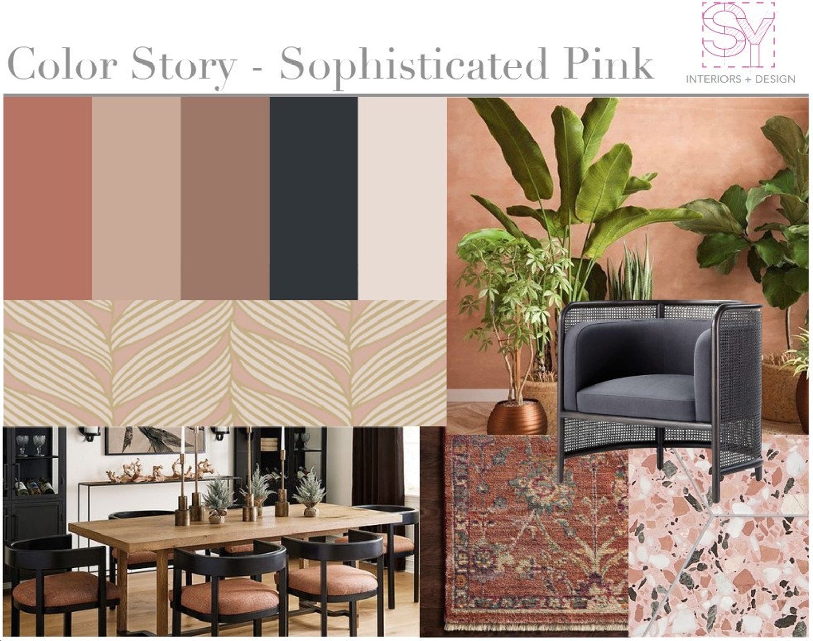
A color story isn’t about using every color imaginable; it’s about restraint and thoughtful repetition. A common and effective approach is the 60-30-10 rule. This principle suggests that 60% of your color palette should be your dominant color, 30% should be your secondary color, and 10% should be your accent color. The dominant color is typically applied to walls and large furniture pieces. The secondary color can be used for upholstery, curtains, and larger decorative items. The accent color is for smaller touches like throw pillows, artwork, vases, and decorative objects, providing pops of interest and personality. This rule provides a balanced and visually appealing distribution of color.
Explore different color palettes as inspiration. Pinterest, Instagram, interior design magazines, and even nature can be incredible sources of color story ideas. Look for images that resonate with you and try to identify the key colors being used. Consider palettes inspired by nature, such as a coastal palette of sandy beiges, muted blues, and seafoam greens, or a forest palette of earthy browns, deep greens, and subtle grays. Art can also be a fantastic source of inspiration. Examine a favorite painting and pull out its dominant hues and complementary tones to create a sophisticated color story. Travel destinations can also spark ideas; a Moroccan-inspired palette might include rich terracotta, deep indigo, and golden accents.
When selecting your dominant color, consider the overall light in your home and the size of the room. Lighter, cooler colors can make small rooms feel larger and brighter. Darker, warmer colors can make large rooms feel cozier and more intimate. Natural light plays a crucial role. A room with ample natural light can handle deeper or more saturated colors, while a room with limited light might benefit from lighter, reflective hues to maximize the available brightness. Test paint samples on your walls in different lighting conditions (daylight, artificial light) to see how they truly appear before committing.
Your secondary color should complement your dominant color and add depth. If your dominant color is a soft gray, your secondary color could be a muted blue, a warm beige, or even a deep charcoal for contrast. This color will likely appear in larger furniture pieces, rugs, or window treatments. It should have enough presence to be noticeable but not so dominant that it competes with your primary hue. The interplay between the dominant and secondary colors sets the stage for the overall feel of the room.
The accent color is where you inject personality and create focal points. This is the color that will draw the eye and add excitement. It should be a color that stands out against your dominant and secondary colors but is still harmonious. If your palette is primarily neutrals, your accent color can be quite bold – a vibrant coral, a jewel-toned emerald, or a striking mustard yellow. If your dominant and secondary colors are already saturated, a more subtle but still distinct accent color might be appropriate. Use this color sparingly but strategically to highlight key features or add visual interest.
Don’t overlook the importance of neutrals within your color story. Even with a vibrant palette, neutrals play a vital role in grounding the scheme and providing visual breathing room. Think about incorporating a range of neutrals – from crisp whites and warm off-whites to various shades of gray, beige, and even black. These can be present in your wall paint, furniture upholstery, wood finishes, and decorative accessories. A well-placed neutral can prevent a color scheme from feeling overwhelming and enhance the impact of your chosen colors.
Consider the architectural style and period of your home. While you don’t need to be rigidly bound by historical accuracy, understanding the typical color palettes associated with different architectural styles can provide a helpful framework. For example, a Victorian home might lend itself to richer, deeper colors and intricate patterns, while a mid-century modern home might favor cleaner lines and a palette of earthy tones with pops of bright color. This consideration can enhance the inherent character of your home.
Think about how your color story will flow from room to room. While each room can have its own unique personality, there should be a sense of continuity throughout the house. This doesn’t mean every room needs to be painted the same color, but rather that there’s a shared thread that connects them. This can be achieved by using a consistent neutral or by carrying one or two of your accent colors through different spaces. This creates a cohesive and intentional feel as you move through your home.
When selecting materials and finishes, consider how their inherent colors will integrate with your chosen palette. The finish of your wood furniture, the metal in your lighting fixtures, the texture of your fabrics – all these elements contribute to the overall color story. A brushed brass finish will feel warmer and more golden than a polished chrome finish, which is cooler and more reflective. The weave of a linen fabric will have a different visual weight than a plush velvet. Pay attention to these details for a truly integrated design.
Don’t be afraid to experiment with different shades and tints of your chosen colors. If you’ve decided on a blue color story, explore the spectrum from soft sky blues and deep navy to vibrant cerulean and muted teal. Varying the saturation and lightness of your colors within the same hue family can add complexity and visual interest without deviating from your core story. This allows for depth and sophistication within your chosen palette.
Finally, trust your intuition. While color theory and design principles provide valuable guidance, your personal preferences are paramount. Your home should be a reflection of you. If a particular color combination excites you and makes you feel happy and comfortable, then it’s likely the right choice. Don’t be swayed by trends if they don’t align with your personal style. The most successful color stories are those that feel authentic and bring joy to the people who live within them. Regularly reassess your color story as your tastes evolve or as you redecorate, ensuring your home remains a vibrant and personal sanctuary.
